The Challenge: How Do You Advertise a New Healthcare Product?
Mimio, a newcomer with no direct market comparison, needed ad sets that could explain its product's unique value. These ads had to serve as an introduction, a sales tool, and a way to test audience engagement.
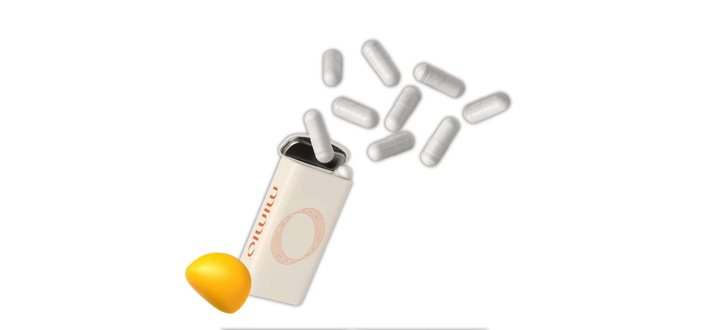
How do you advertise something completely new? Especially a healthcare product that has never been advertised before.
It was a question CD Catherine and team had to ask themselves when thinking out advertisements for Mimio’s launch.
As a totally new product, there was nothing on the existing market to compare it with, providing Designity with the opportunity to put our people and processes to good use to shape Mimio’s narrative and unique visual identity.
Not a problem.
What Mimio needed was to package its consumer brand into advertisements for a variety of major publications, and to also be used for social media and A/B testing, as well as pay-per-click (PPC) and retargeting campaigns.
Since Mimio was a newcomer in the market and had not yet been publicly showcased in advertising, this necessitated that these ad sets serve equally as an introduction to the product, an active sales tool, and an audience testing ground.
The Solution: Comprehensive Ad Set Design
After a thorough review, Designity created 6 ad campaign sets with 79 optimized graphics for social media and PPC, all targeting different audiences with tailored messaging and visuals.
Rather than operate from a need-basis of tackling one ad set as the need arises, it was decided to ideate six separate sets of ad campaigns. Each set would be targeted to different audiences with variable messaging and visuals that would appeal most to that audience.
This would allow Mimio to have ample creative to test while also having advertising creative ready for any opportunity that might arise.
Phase 1: Ad Landscape Review
Before any design work takes place, CD Catherine always reviews the landscape for where the creative will live.
In this case, this step involved reviewing the existing advertising of major and minor players in the healthspan and longevity space. This review is highly collaborative and done with the client to ensure true understanding.
It included the following three core steps:
- Ad Collection: Catherine and the client brought together more than 70 samples of existing advertisements and placed them in a collaborative Miro board.
- Bucketing: Through a facilitated discussion, the client placed ads into a ‘Not a Fan’ and ‘Like These’ bucket. Anything leftover was placed into a ‘Maybe?’ bucket.
- The Why: By reviewing and discussing what was placed into each bucket and why, the creative direction for the project was set. It was just about applying these ‘Why’ principles to the Mimio brand in ad format.
Phase 2: Preliminary Ad Concepts
Catherine briefed Senior Creative Nicolle on the account with all of the discovery details from the ad landscape review.
Once briefed, Nicolle was then able to put together two options for each segment outlined in the brief. These preliminary concepts were refined during an internal review to ensure brand application consistency across the other ongoing design projects.
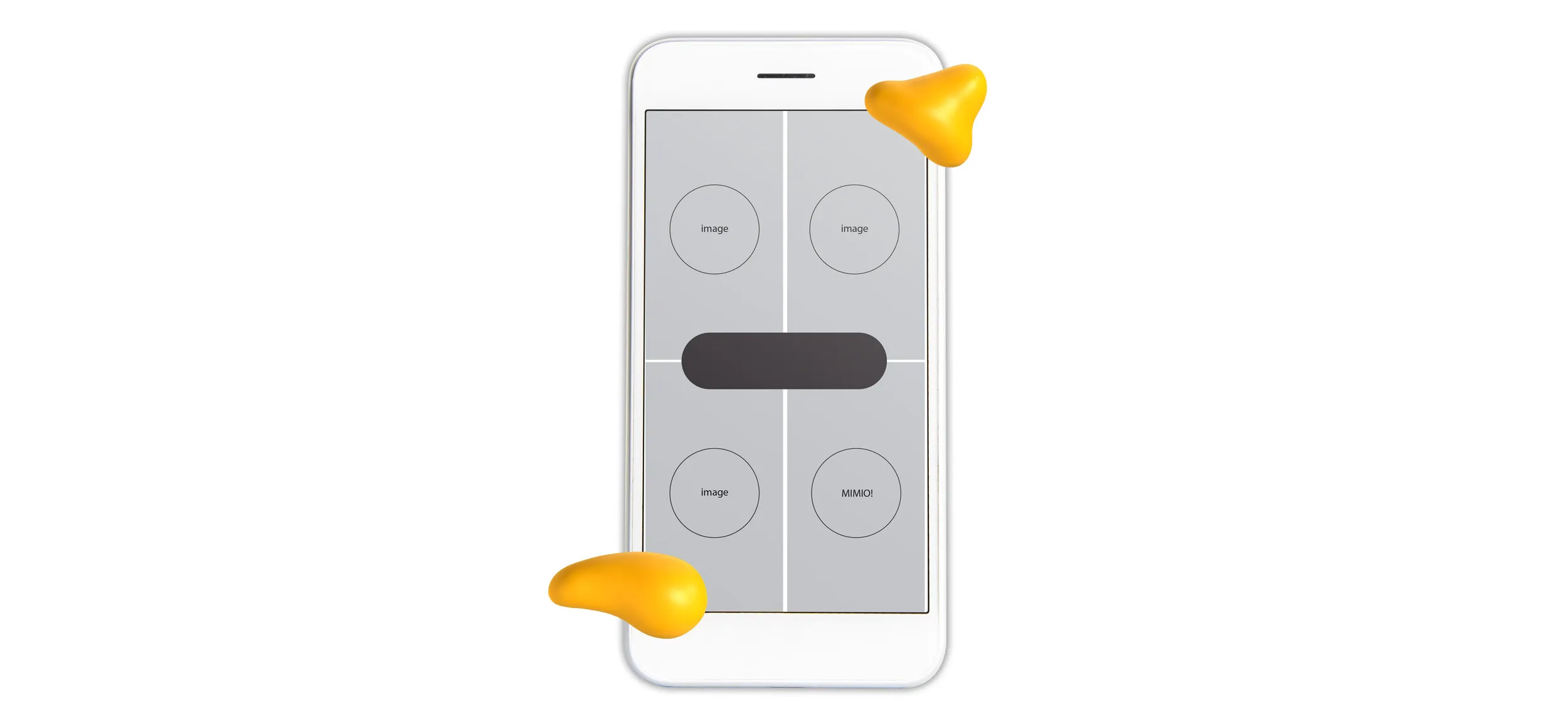
After internal review, the set concepts were shown to the client in two sizes.
These two sizes present the most visually captivating size (1080x1920 for full mobile screen) and a visually limited size (728x90 for PPC). Each set was presented in context with its segment and unique strategy.
Phase 3: Revised Ad Concepts
After thorough client review and discussion, five of the 10 concepts were selected for further refinement and concepting. The revised concepts used a more definitive visual strategy focusing in on key design details and copy.

Phase 4: Ad Set Build Out
Throughout each phase, it was decided that an additional segment should be optimized for and was added into one of the final selected directions as a 6th set. Designer Nicolle then implemented the selected concepts and client-requested refinements into a comprehensive list of social and PPC design sizes — a total of 79 individually optimized graphics.
The Results: Increased ROI From an Advertising Arsenal
The ad sets were deployed in Meta A/B testing, featured in paid placements like Men's Journal and Vogue, and stored for future use, giving Mimio the flexibility to advertise without worrying about creative deadlines.
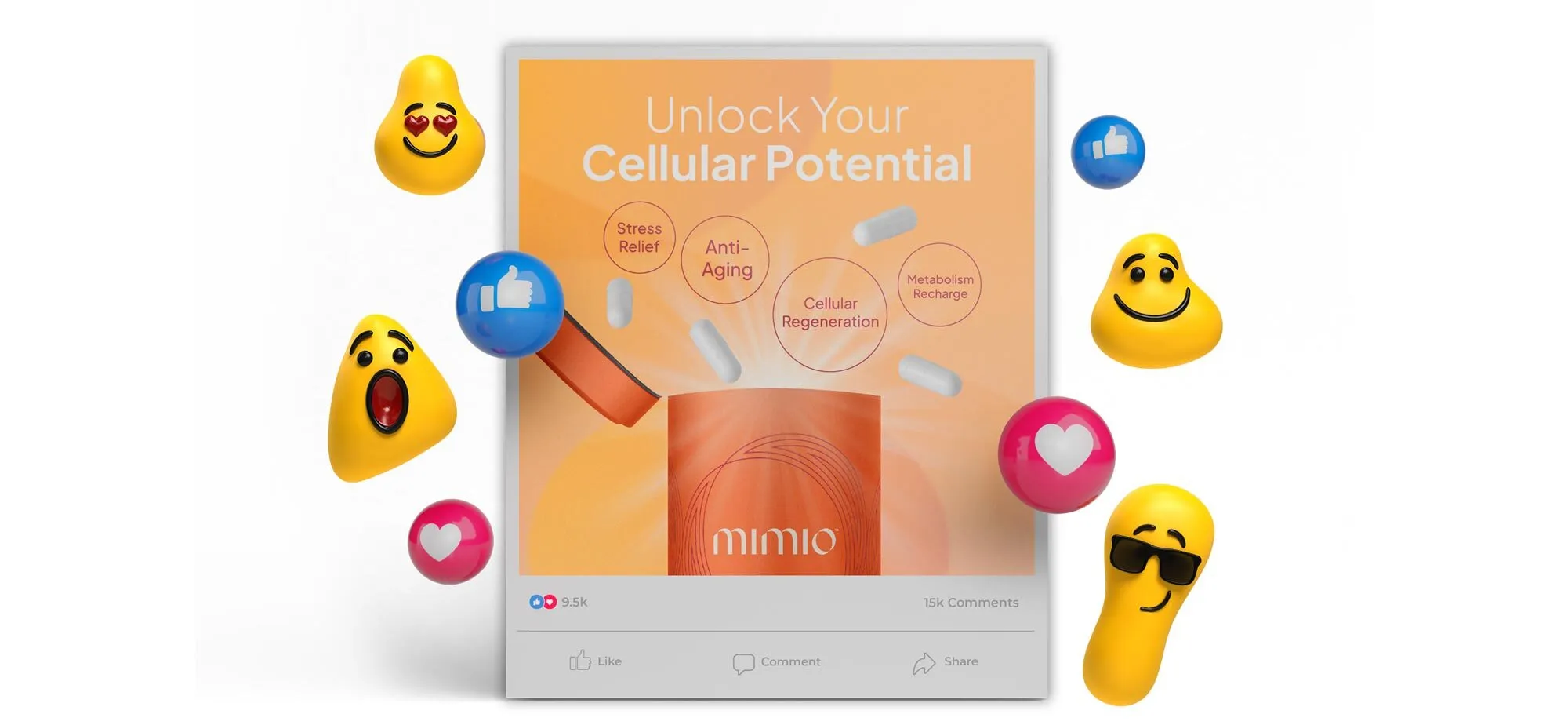
The ad sets were immediately deployed into a Meta A/B test on color, into paid placement on Men's Journal and Vogue, and tucked away for any future ad needs.
By having a bank of great-looking ad sets to pull from for any segment of Mimio’s audience, they are able to be reactive and unburdened by creative deadlines and able to execute on advertising opportunities without a second thought.
Who is Mimio Health?
Mimio Health is a biotechnology nutraceutical company dedicated to the research and production of the world's first fasting mimetic supplement.
The Mimio daily supplement was designed from clinical research to replicate the cellular health benefits and lifespan-promoting effects of fasting without the need to actually fast. Their patent-pending formulation uses a rigorously selected combination of the same bioactive human metabolites that induce a regenerative "bio-program."
