Creative packaging design is about so much more than just pretty colors and bold typography. It’s about helping your clients connect with their own target audience, understanding their wants and needs, and helping them deliver an unboxing experience to remember.
Our job, as designers and creatives, is to take those brightly colored ideas from our clients and to deliver something that’s eye-catching and showcases the best parts of their brand identity. In order to help you deliver on that promise, we’ve compiled a list of packaging design ideas from our own arsenal to inspire you.
Here are four of our favorite packaging design projects, handpicked just for you.
Why packaging design is so important.
If you’ve been on TikTok lately, you’ll notice that influencers and consumers notice one thing about a product the moment they open that UPS box. It’s packaging design.
It’s often the first thing that they comment on, too.
A company’s package design is the first tangible impression that consumers have of your client’s brand. This is why your choice in this area, as the designer, is just as important as the product itself.
They could have a great product, but without great package design, it might get left on the shelf and never make it to the checkout line.
Some consumers will buy a product simply because of its unique packaging.
Minimalist design.
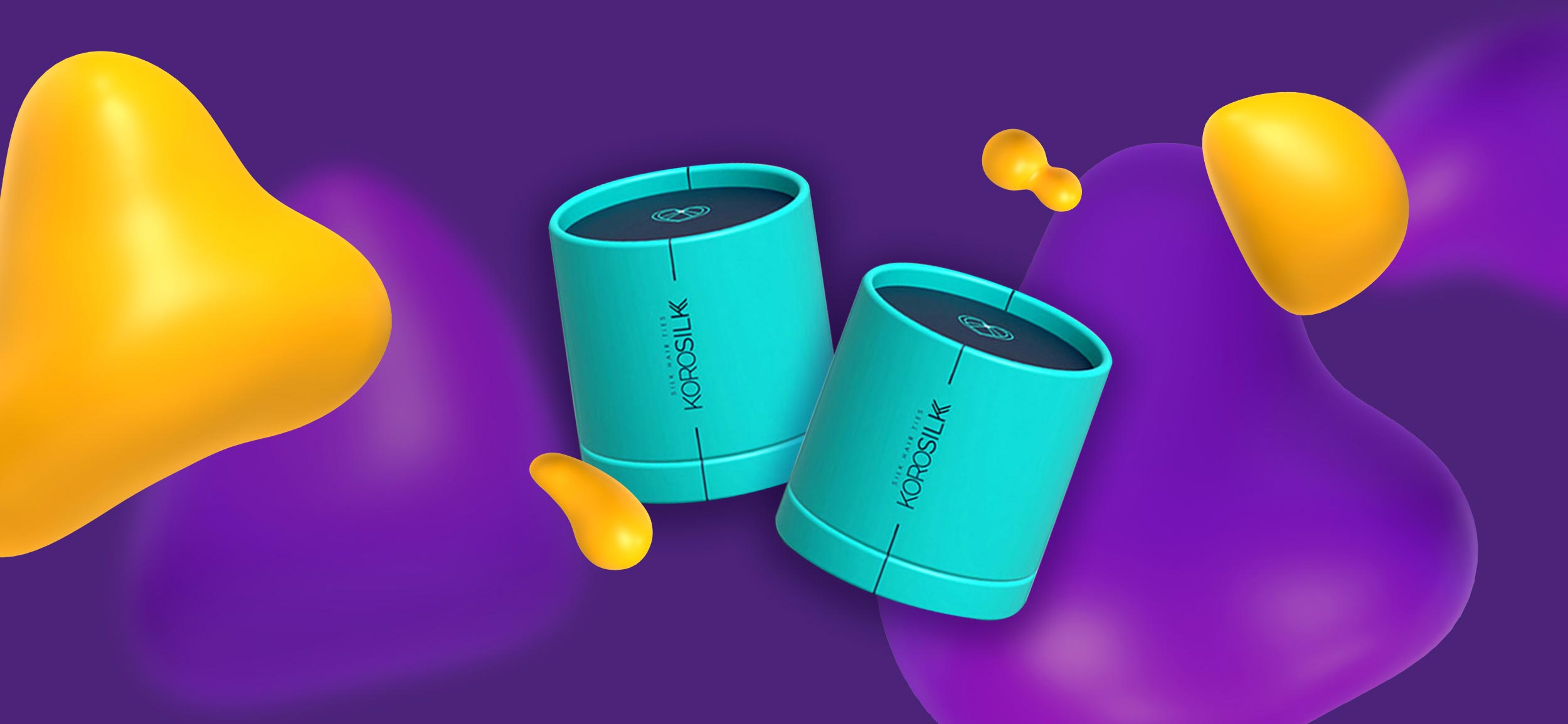
Our client, Korosilk, approached us to transform KoroSilk's brand identity into package designs that perfectly aligned with their image. We needed to create packaging that was not only luxurious but also approachable and minimalist, while maintaining 100% recyclability.
Our client specifically requested that the packaging evoke a sense of exclusivity, making the customer feel like they're receiving a unique, one-of-a-kind gift.
We had to get creative with our approach. Instead of using actual ribbons or wrapping paper elements, we developed reusable design assets while still maintaining the feeling of a bespoke gift.
The result was a carefully crafted package design that effectively captured KoroSilk's brand identity. The reusable elements allowed for consistency across all products, while the packaging itself felt like a special gift to the consumer.
The packaging is minimalist, but still delivers a visual punch.
Bold and colorful.
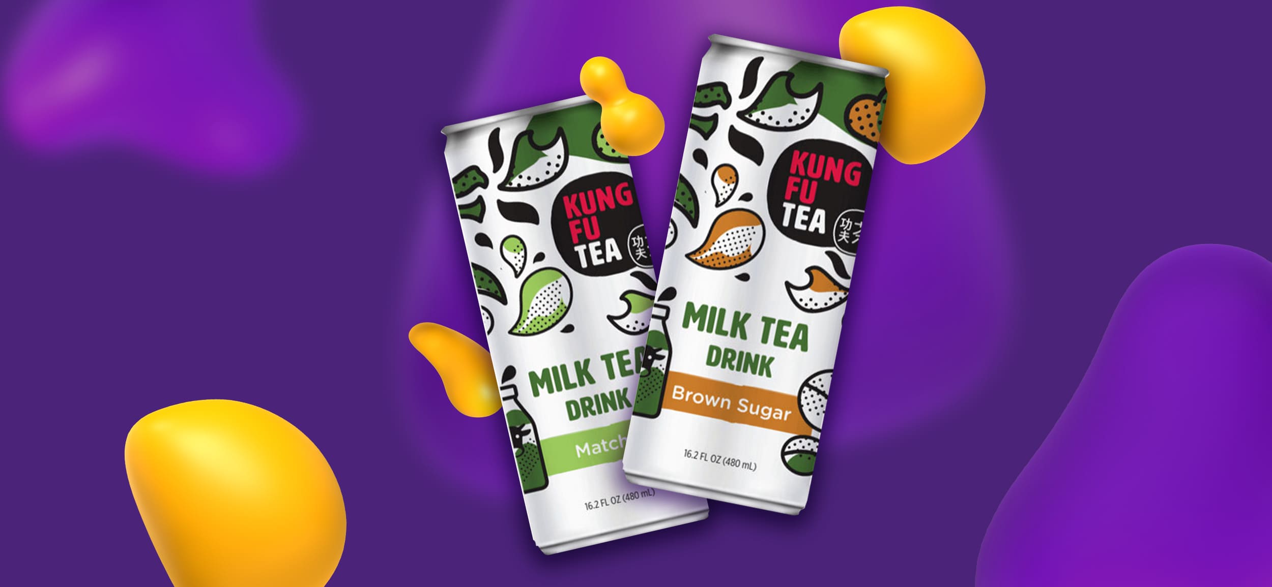
At the core of any successful beverage company is brilliant packaging and label design.
Kung Fu Tea wanted a fresh approach for this product launch, so they decided to incorporate playful illustrations, bespoke branding elements, and custom graphics.
This project turned into an exciting exploration of design possibilities. The team worked tirelessly to create a striking, eye-catching design that would stand out in a crowded beverage market.
The result was a vibrant and bold design that stood out on the shelf and effectively communicated the quality and sophistication of the brand.
If the target audience fits, don’t be afraid to deliver versions that are bright and playful. You never know; your client might choose that one!
Eco-friendly design.
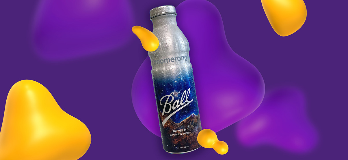
Eco-friendly is at the heart of Boomerang’s mission: To bring sustainable bottling practices to a business near you.
When they approached us to help them create a custom bottle design for their brand partners, we had to think big. How can we design something that is both eco-friendly and impactful?
As it turned out, the answer was in the details.
The final result was a sleek and clean bottle design featuring lovely night sky imagery to emphasize the zero-waste sustainability model the company stands for.
A bottle that customers would be happy to use over and over again. Exactly what Boomerang was looking for.
Interactive design ideas. (Wizard)
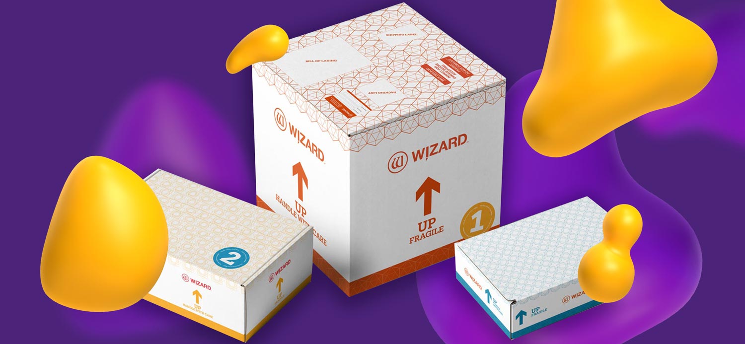
Our client, Wizard, had a "no leftover packaging" policy and challenged us to come up with a packaging design that would make their expensive equipment stand out while also engaging their target audience with an interactive design. Our mission was to create packaging that would make customers feel like they were opening a present.
We collaborated with them to develop a packaging design that was as engaging as it was visually appealing.
But we didn't stop there. To complete the package, we also designed a user manual that matched the premium aesthetic of the equipment. We wanted to make sure that every aspect of the product experience was top-notch, from the moment the customer opened the box.
Interactive packaging design doesn’t have to be overly complicated. It could be as simple as rethinking the unboxing experience and making it memorable. Don’t wait for your client to ask for an interactive design. Offer versions of this and broaden their creative horizons.
Conclusion
We hope that these packaging design ideas have inspired you to think outside the box and get creative with your client’s packaging design projects. Whether they’re looking to create a premium brand image or just want to make their product stand out on the shelves, there are endless possibilities for creating packaging that wows clients and keeps them coming back for more.
So, go ahead and let your imagination run wild! Experiment with different colors, materials, and design elements to create packaging that truly reflects their brand and resonates with their customers.
Remember, the sky's the limit, and with a little bit of creativity and a lot of fun, you can create packaging that truly stands out in a crowded marketplace.


.webp)


.png)












.png)
