Designity beta 1.0 was born as DesignedIn – sound familiar?
As already made obvious, brands aren’t fixed creatures. Designity was first born in 2015 as DesignedIn, a platform emerging from the educational frustrations of our founder and CEO, Shahrouz Varshabi. The model was initially built to give design students opportunities to work with clients in real-world experiences, while also building their portfolios.
However, behind the genius concept was a major problem–the name DesignedIn. Any guess why? If there’s one lesson to learn about evolving as a brand, don’t get inspiration from LinkedIn. At this point in the journey, getting inspired from a big-name network seemed like a good idea, a great idea actually. To our surprise, LinkedIn was not a fan of us owning the name DesignedIn, claiming most words ending in “ed” and “in” belonged to them. After being sent a legal notice and settling the conflict, we realized the mishap was actually a blessing in disguise.
“One of my biggest mistakes as an entrepreneur was purchasing a premium domain (Designedin.com) for $5,000, which was all of my savings at that time. Not too long after that mistake, Linkedin made us realize that our values have changed and we needed a better name. I only spent $9.95 to purchase our new name, Designity.com. I see many entrepreneurs making the same mistake over and over and get distracted by fancy names and branding, only to forget the fact that branding is a process.”
– Founder and CEO, Shahrouz Varshabi
Creative directors came to our rescue.
After finalizing the biggest hurdle most brands face (picking a name) it was time to focus on Designity’s core mission: create a mutually beneficial platform for student creatives and clients to collaborate. Remember when we said design was a process? It was at this moment we made it our motto. As we grew our creative network to about 10,000 student creatives, we faced a new major issue–quality control.
In order to combat quality concerns and still manage to expand past the 10,000 mark, it was time to get to the drawing board. This was when our platform became the collaborative model we’re known for today by inviting professional creative directors to supervise students for quality assurance in 2017. As time passed, creatives outside of universities joined, eventually expanding our network into three creative divisions: emerging, senior, and pro. The diversification of our onboarded talent with the expertise of longtime creative directors was the match made in heaven the industry didn’t know it needed.
We thank Instagram Live & money.
As our model’s wings began to grow, it was just a matter of time it would catch the attention of investors. The unique framework was especially appealing to Amazon’s Audible Investment Firm (NVP), which invested in our mission in 2018, giving us the foundation to fly. As mentioned by NVP stakeholders, the integration of creative directors and all levels of creatives differentiates Designity from freelance marketplaces, traditional advertising agencies, and in-house teams. While we knew we were doing something right, this investment assured us that we were headed in the right direction.
Even at this point with three years under our belt, our model has yet reached its maturity. We couldn’t understand what was missing, but something just was. That’s when we started to dig deep and evaluate our weaknesses: project proposals, extra revisions, late feedback, and more. This was when our founder took his concerns to Gary Vee’s Instagram Live (we 100% recommend doing this) to fix our issue in 2019. The business expert suggested we turn our per-project model into a subscription model, offering companies monthly flat rates for unlimited services. Genius. So, we took the idea and ran, and the rest is history.
We beat COVID-19, literally.
We’ve all felt the effects of COVID-19 in one way or another. Design and marketing departments were particularly among the first to be laid off to sustain budgets worldwide. Luckily our remote model saved us not only from getting the virus at work, but it saved companies a lot of headaches during such an intense time. Many companies struggling with similar budget concerns still needed to fulfill their marketing campaigns and continue their creative projects. The virus may have stopped many things, but it didn’t stop the need for creativity.
That’s where we came in. Established companies needed a reliable way to get their projects completed outside of sketchy freelance marketplaces and costly agencies. There was no time to waste and extra money to spend. This is when we realized we were way ahead of our time and our model started to really pay off. Brands began approaching Designity for their very own US-based creative teams for a fraction of the cost of full-time employees. It was a win-win situation.

The new branding says it all.
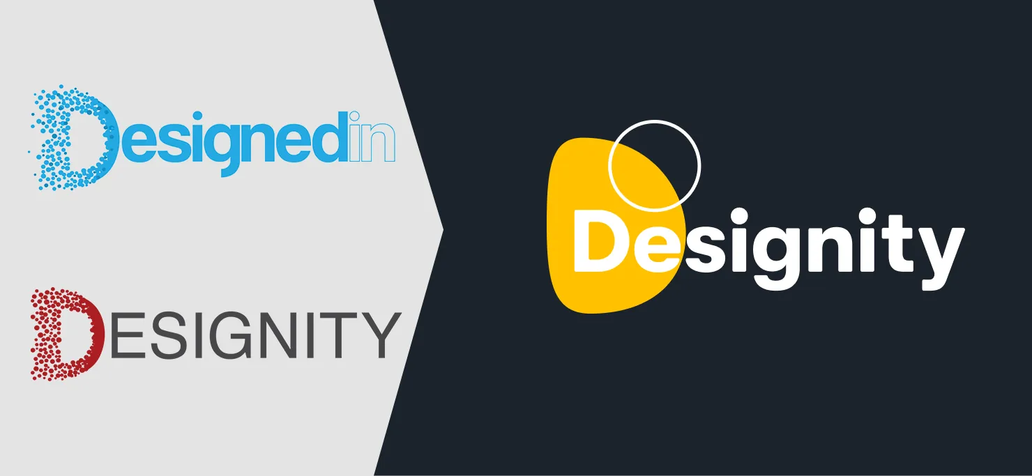
In order to prepare for global activation, we knew we needed a new look to support our fast-growing model. To be an empire, you have to look like an empire, and no shade to us, but we looked like another shady marketing agency (sorry, team). Our initial approach to our logo was meant to bring a community of creatives (circles) together to form the “D,” however, we’ve learned that we’re much more than just a creative community.
As 2021 approached, both our internal team and client base grew tremendously. With significant growth like this, change was long overdue. This meant a new logo, a fresh color palette, a new font, and a whole lot of other things that represented our interconnected world. Everything had to go and here’s how we honored the old to create the new.
Our circle is purposeful.
If there’s one thing we’ve nailed, it’s our circle (team). Every client is provided with a designated creative director to manage specialized creatives. Each team member serves a purpose within their area of expertise to ensure that every part of a project receives undivided attention and focus. Without these circles, our model ceases to exist. This is where the circle plays an integral role in our logo and branding, representing the teams we work hard to build. 360 degrees of teamwork makes the dream work, and we’re proof of that.
Design is a process.
Perfection has proven time and time again to be a fantasy that doesn’t exist. Every time we thought we hit our best, we realized there was better to do, to create, and to be. This is especially true in the creative space, where design is indeed a process. Our abstract approach to our branding symbolizes the surrender to this reality.
The curves, slopes, and asymmetry is representative of all that design embodies: subjectivity, imagination, and the ability to morph nothing into something. We don’t strive for perfection or to fit the mold, we create the mold....but with a twist.
Collaboration is key.
We wouldn’t be who we are without collaboration. Community is an integral part of Designity and quite literally in our name. It’s what allows our network of creatives to share their strengths and creativity with others to create something that’s spectacular and unique. Because collaboration is something you have to experience, we needed this key value to shine bright, literally.
Here enters our beloved yellow, #FFC200. Yellow is known for its vibrant effect in enhancing energy and happiness. It’s also known to promote clear thinking and quick decision-making, something we all could use along the design process. Plus, it’s bold. We like bold.
This is just the beginning...
Even with all of these dramatic changes, we’re just getting started. We’re thrilled that our new brand reflects our unique position and exciting things we’ve got in store. But for now, this little facelift we’ve got is just the beginning of how we plan to revolutionize creativity–for brands and creatives alike.
<div class="c-blog_comp-cta cc-component-1"><div class="c-blog_comp-cta-left"><div class="c-blog_comp-cta-left-wrap"><img src="https://global-uploads.webflow.com/61cdf3c5e0b8155f19e0105b/6369722e59155470b6840033_Potential-clients.png" loading="lazy" alt="" class="c-blog_comp-cta-left-img"></div></div><div class="c-blog_comp-cta-right"><div class="c-blog_comp-content"><div class="c-text-wrapper cc-mb-32"><div class="c-title-4 cc-bold"><strong>Want to save money without sacrificing the quality?</strong></div></div><div class="c-text-wrapper"><div class="c-text-2">Say goodbye to traditional, expensive agencies and unreliable marketplaces. Say hello to Designity.<br></div></div></div><div class="c-blog_comp-wrapper"><a href="/pricing" target="_blank" class="c-button cc-primary cc-inverted w-button"><strong>Get Your 2-Week Trial</strong></a></div></div></div>

