We all know just how mission-critical it is for a brand to have an effective way to generate leads and get potential customers into the marketing funnel.
And that’s why a good lead generation page is worth its weight (or pixels) in gold.
But just what makes a page a good lead generator?
That’s the million-dollar question, friends. And if you’re looking for some inspiration to get you going in the right direction, you’re in the right place!
Today’s blog is taking you through 5 stellar lead gen examples to show you what elements make a great lead gen page and how you can apply them to help boost your client’s conversion rates, improve their marketing campaigns, and grow their business!
Envase
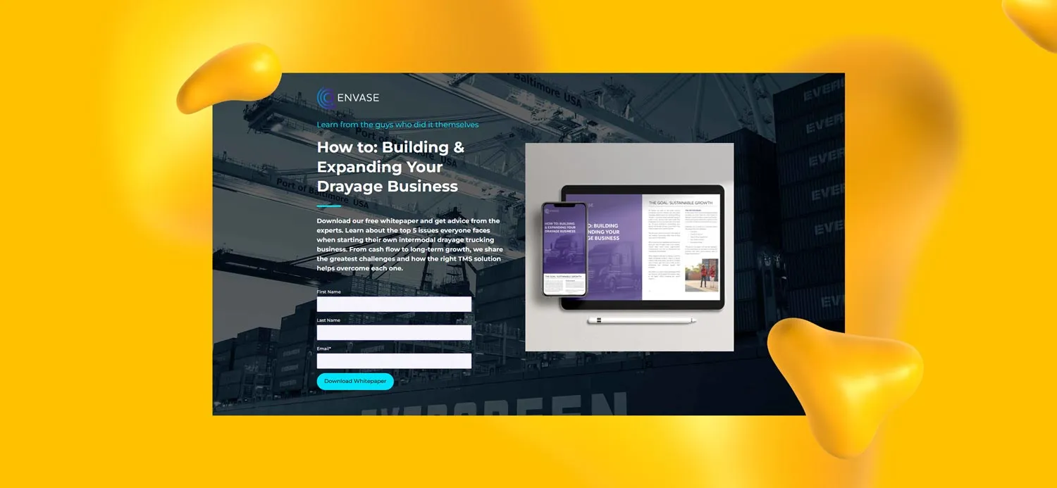
We’ll start our list off right with a lead gen page created for one of our own Designity clients.
Meet Envase, a leading drayage software solutions company, that uses the above page to attract and engage newcomers to their brand and get them into their sales funnel.
What makes it great: There’s a reason it’s such a successful lead-generation tool!
Created by CD Joseph C. and his team, it hits all the right notes in a lot of different ways.
The tagline, “Learn from the guys who did it themselves” injects a personal touch. Then there’s the design itself, which is clean and makes good use of Envase’s purple and blue color scheme against a very cool black-and-white background photo of a container ship at work.
The copy is short and sweet, and the information it’s asking for in exchange for a free whitepaper is simple and to the point, just name and email address. What more could you ask for?
Very nice!
Backlinko
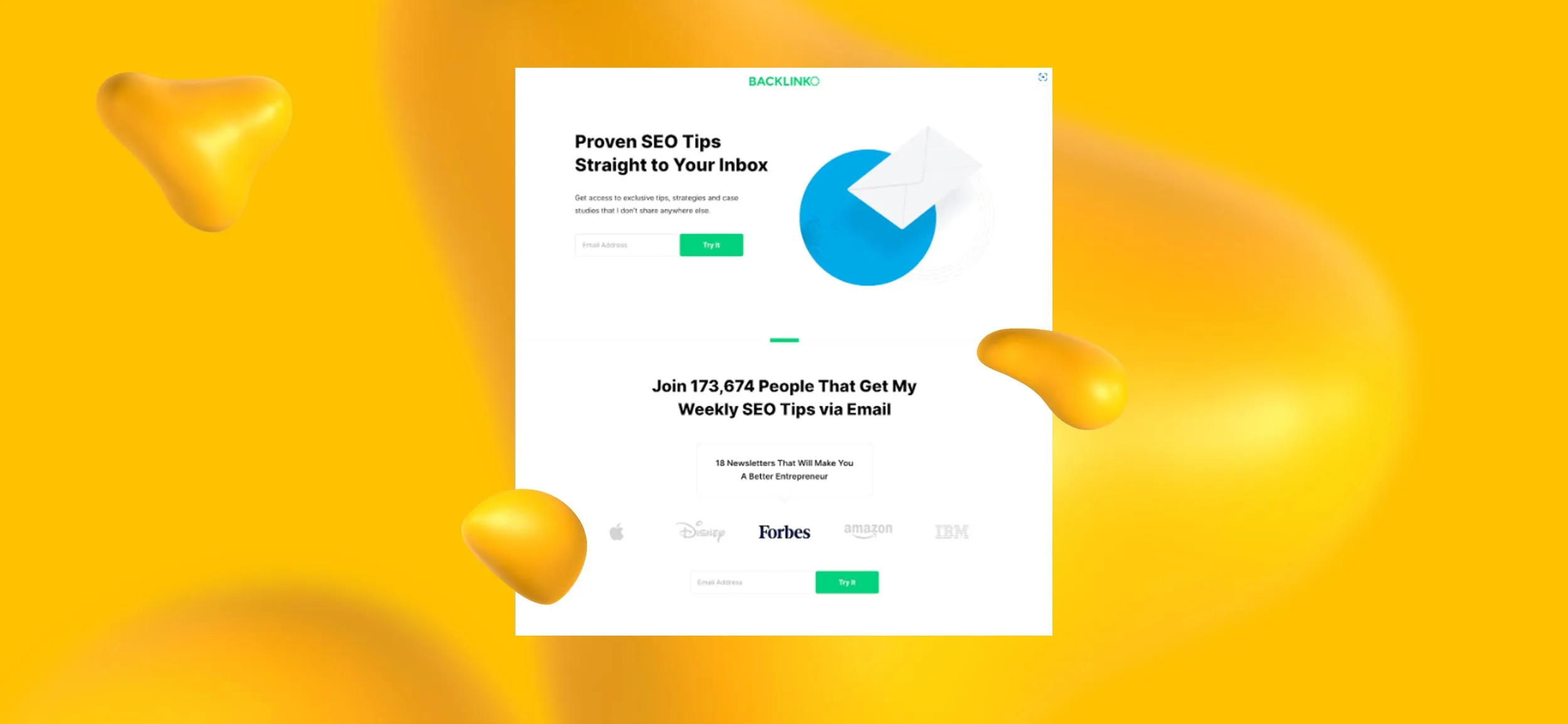
Next up is this offering from Backlinko, a company that specializes in SEO training and link-building strategy.
The lead gen page pictured above is just for an email sign-up, but nonetheless, it does a great job at convincing a visitor that there is value to be had from signing up!
What makes it great: We love the simplicity of this design! It’s short, succinct, and right to the point, only giving you the info you absolutely need to know.
We also love the use of copy here.
Proven SEO tips? Exclusive tips?? Sign me up!
The list of companies down at the bottom along with the number of subscribers is also a great trust indicator. Great job, Backlinko!
ClearBrand
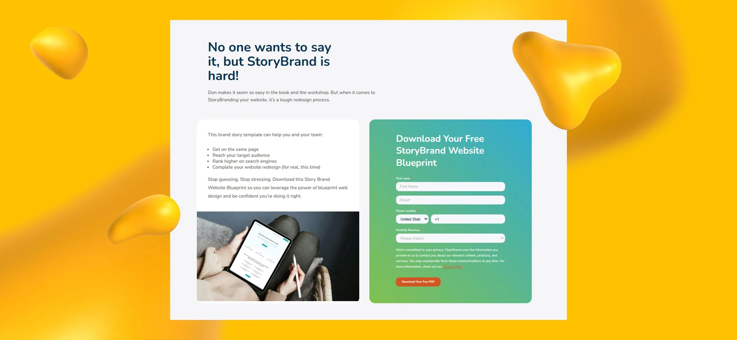
Did we mention how much we love a good, clean, simple design?
Laying out your information so that it's to the point and easy to read is just a great lead-generation strategy. Take this example from ClearBrand, a pay-per-lead digital marketing agency, which offers up a free StoryBrand website template in exchange for just a few tidbits of information from their visitors.
What makes it great: "No one likes to say it, but StoryBrand is hard!"
That's probably exactly what many of their visitors and thinking too, and StoryBrand hits that pain point straight away, offering up a valuable free web template as a solution. The form is just as straightforward, only asking for a name, email address, and marketing revenue.
We also like that can't-miss-it orange CTA button.
Great job, ClearBrand!
Nauto
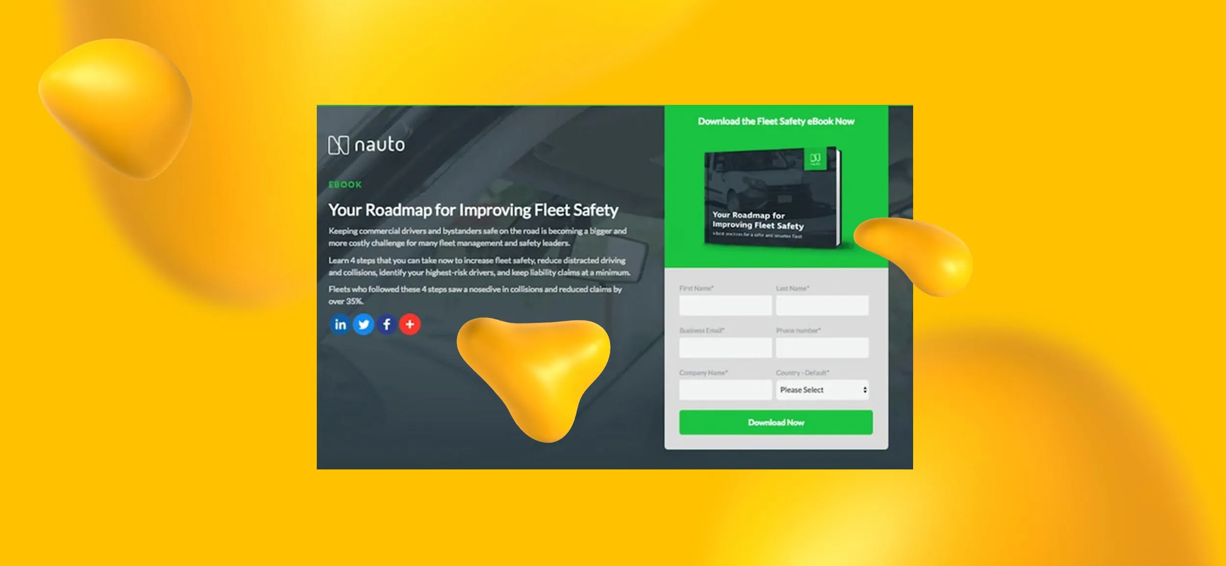
This is a striking lead gen page from AI driving software company, Nauto!
It asks visitors for only a few pieces of information in exchange for a sweet fleet safety ebook and that seems like a great trade to us too.
What makes it great: We really dig the lime green/charcoal color palette. It’s easy on the eyes and the copy is crisp and persuasive with numbers (4 steps, 35% percent reduced claims!) that catch the eye.
The easy-to-follow social handles included beneath the copy are a great touch too and an easy way for their target audience to engage even if they aren’t quite ready to hand over information. Overall, a lot of good choices here.
What we’d change: The only thing we’d want to change would be the unused space below the social handles. That would have been a great spot for some infographic-style illustrations to really drive their point home!
Sprout Social
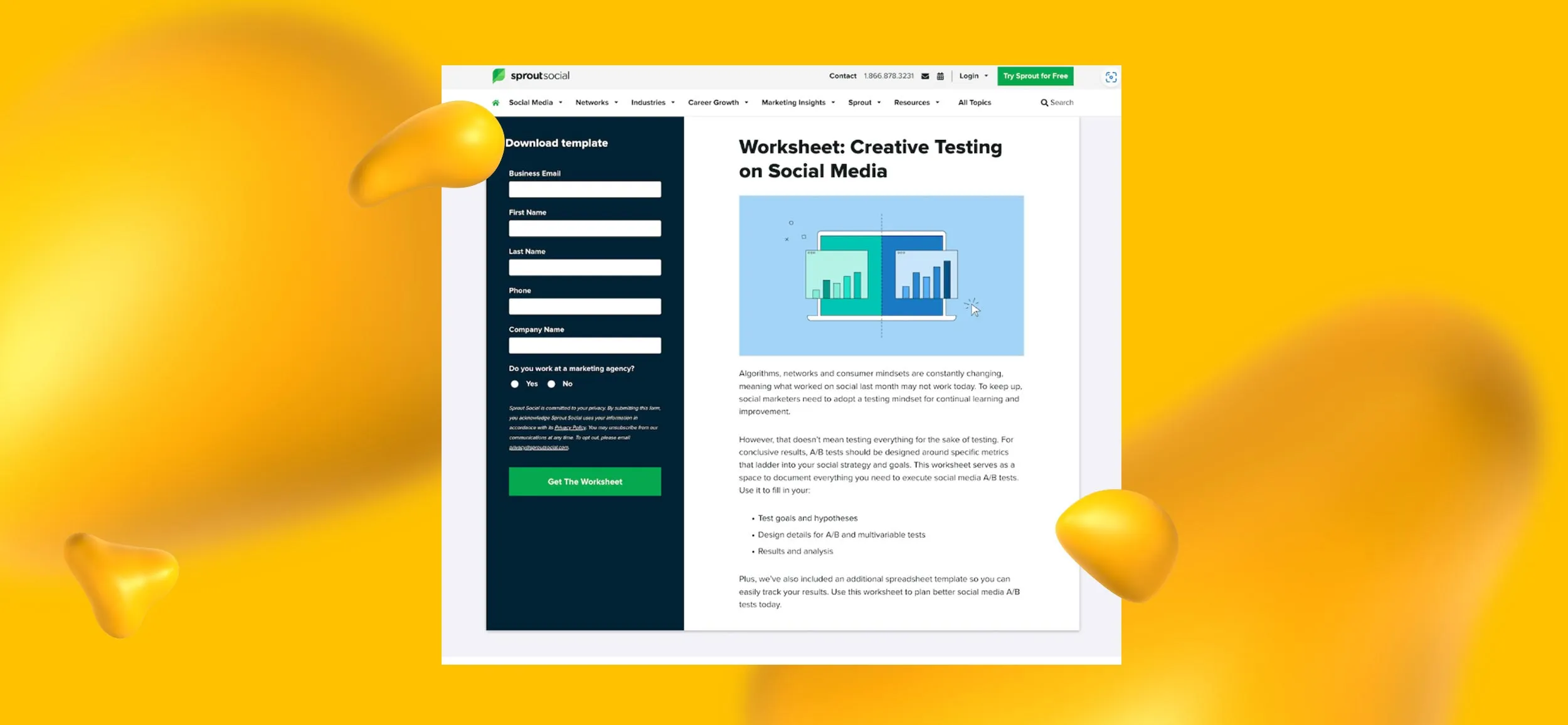
Check out this nice example from the social media management company, Sprout Social.
This lead gen page offers up a creative testing worksheet in exchange for a bit of information from its visitors.
What makes it great: We love the interesting two-column approach they took here. It’s a bit unusual for a lead gen page, but the color scheme, the illustration, and the copy make it work.
There’s a bit more to read on this page than others, but the way the copy is divided up, the bullet points, and the clear CTA make it an easy read.
What we’d change: The only thing we would have liked to see here is some more illustrated icons, perhaps in place of the bullet points to break up the copy even more. Other than that, it’s a solid design!
<div class="c-blog_comp-cta cc-component-2"><div class="c-blog_comp-cta-left"><div class="c-blog_comp-cta-left-wrap"><img src="https://global-uploads.webflow.com/61cdf3c5e0b8155f19e0105b/63695243d096983691046ac3_Potential-Creative.png" loading="lazy" alt="" class="c-blog_comp-cta-left-img"></div></div><div class="c-blog_comp-cta-right cc-dark"><div class="c-blog_comp-content"><div class="c-text-wrapper cc-mb-32"><div class="c-title-4 cc-bold"><strong>Like to work as a freelancer with consistent income?</strong></div></div><div class="c-text-wrapper"><div class="c-text-2">Designity's collaborative model is designed to give you all of the perks of being a freelancer without the income instability.<br></div></div></div><div class="c-blog_comp-wrapper"><a href="http://designity.com/creatives" target="_blank" class="c-button w-button"><strong>Join Our Creative Community</strong></a></div></div></div>
Want to Share Your Skills?
If you're looking for a place to share your top-notch lead-gen skills (or your graphic design, copywriting, marketing skills, or anything else for that matter) why not consider joining the Designity community?
At Designity, you can enjoy consistent work with a huge variety of different clients in any industry you can imagine. You’ll also enjoy the freedom to work your own hours and to focus on what you do best while letting someone else handle the clients and the paperwork.
And best of all, you get to do it all from the comfort of your own home.
A flexible schedule, no morning commutes, and a 100% remote job? What could beat that?
If you think you have what it takes to join our community, then why not apply today?
You might just be that next new talent we're looking for!


.webp)
























.webp)
