.webp)
When your customers are browsing store aisles or scrolling through online marketplaces, trust us when we say it’s not your product’s quality, taste, or performance that jumps out at them first — Nope, it’s your packaging design.
As wonderful as your product might be, your customers will still make snap judgments on it based on things like the color, font, imagery, and layout of your packaging and labels before they even think about experiencing what’s inside. And if your packaging isn’t working for you, friend, it’s working against you!
So, if you have reason to believe that your packaging isn’t doing enough to grab attention or drive sales, it’s high time for a redesign. But before you rush to the drawing board, today’s blog is here to make sure your new design sets you up for success.
Today, we’re breaking down the most common package design mistakes that could be hurting your brand and, more importantly, how you can fix them to create a design that stands out, boosts your brand, and gets you the results you want!
Let’s dive in!
How Poor Packaging Design Can Affect Your Brand and Sales
Your packaging is more than just a cardboard or plastic container to hold your product.
It’s also a silent salesperson too! Whether you intend it or not, your packaging is communicating your brand’s identity, value, and the quality of your product in just a glance. A well-designed package draws in customers, builds trust in your brand, and boosts your recognition, while a poorly designed package …. well, just doesn’t.
If your packaging design isn’t working for you, here are some ways it could be negatively impacting your brand and your sales:
- Getting Lost in the Crowd — Bland, cluttered, or unmemorable packaging gets lost among competitors, making it harder for customers to notice your product.
- Weakened Brand Recognition — Inconsistent design, poor logo placement, or mismatched colors make it difficult for customers to connect your product with your brand.
- Lost Sales Due to Confusion — Unclear messaging, typography that's hard to read, or misleading visuals can leave customers confused about what your product is or why they should buy it.
- Lower Customer Trust — A sloppy or outdated design can make your product appear low-quality, even if what’s inside isn’t
- Missed Online Conversions — In digital marketplaces, packaging design plays a huge role in product thumbnails and first impressions—if it’s not eye-catching, customers may scroll on by.
7 Common Package Design Mistakes (And How to Fix Them)
Ready for packaging that grabs attention, looks great, and helps you sell more products?
Let’s break down the most common design brands make with their packaging design and show you how to make it right!
1. Overcomplicated Design
.png)
When it comes to your design, yes, you want it to convey all of the amazingness of your product. But sometimes, less is more.
A cluttered layout, too much text, or too many competing visual elements often overwhelm your customers — they’re not sure where to look or what to focus on, which can make it difficult to understand your product at first glance.
If your packaging is trying to cram too much in a small space, it can cause confusion instead of generating interest.
Here’s How to Fix It
Cluttered packaging hurting your sales? Follow these steps to clean it up.
- Keep it clean and simple. Make sure your customers can quickly spot the most important details without having to look very hard.
- Give your design some breathing room. Whitespace isn’t wasted space—it helps key elements stand out. Use it wisely!
- Don’t throw in everything at once. Stick to a few well-chosen fonts, images, and design elements that work together instead of competing for attention.
2. Weak Branding
If your packaging isn’t instantly communicating your brand identity at first glance, then you could be missing a critical opportunity for building brand recognition and customer loyalty.
How do you know if your branding is weak? For starters, check your logo. Is it big enough to be noticed right away? Or does it get lost in the rest of the design.
Are the colors and fonts of your packaging design consistent? Or do they vary from product to product? Do they match your overall brand identity? If your packaging doesn’t make it easy for customers to recognize and remember your brand, it’s time to rethink your approach!
Here’s How to Fix It
If your branding could use some strengthening, here are some points to help you beef it up!
- Make your logo stand out. Your logo is the face of your brand! It should be prominently placed and big enough to be recognizable at a glance.
- Stick to your brand colors and fonts. Keeping these consistent across all packaging helps customers instantly connect your products with your brand.
- Tie everything together. Every design choice—from imagery to layout—should reflect your brand’s personality and support your story.
3. Confusing Typography
.png)
When you only have a few seconds to relay important product information, every word counts.
And to do that, every word must be easy to read. If your customer’s can’t read your product name, tagline, or key details at a glance, that means they might just move on to something else.
Small, overly decorative, or poorly contrasted fonts might be making your text too hard to read, unintentionally frustrating your customers and causing them to walk by your products.
Here’s How to Fix It
Struggling to make your text pop? Here are some simple design tricks to keep your message reading loud and clear:
- Pick easy-to-read fonts. Choose clean, legible fonts that are easy to read but still capture your brand’s personality. Fancy scripts might look pretty, but if customers can’t read them easily, they won’t buy.
- Make your text stand out. Use strong color contrast so words don’t blend into the background. Combos like black on white, white on dark colors, dark font on a light background all work great! Just be sure to avoid overly bright colors that might strain your customers’ eyes.
- Guide the reader’s eye. Use hierarchy to highlight what matters most. The product name and key benefits should grab attention first, with supporting details following.
- Keep it simple. Don’t overcrowd the design. A little breathing room around your text helps everything feel more polished and easier to read.
4. Generic Design
If your packaging lacks originality or is too close to your competitors, you’re going to struggle to stand out.
Things like stock images, pre-made templates, boring color schemes, and meh visuals all conspire against you to leave your product looking forgettable even if what’s inside is amazing.
Here’s How to Fix It
Looking to add some individuality to your packaging design? Here are some pro tips to getting it done:
- See what others are doing (then do it differently). Take a look at your competitors’ packaging to spot common trends. You might just find some opportunities to break the mold.
- Go bold and unique. Use vibrant colors, eye-catching graphics, and design elements that stand out while still feeling like you. Don’t be afraid to show some personality!
- Tell a story. Great packaging makes an emotional connection. Think about what your product represents and how you can visually convey that. A clever design that resonates with your audience will stick with them.
5. Misleading Imagery
We’ve all been burned before.
Products that use the images on their packages to exaggerate size, overpromise, or hide what’s really inside — these misleading images leave you feeling ripped off, disappointed with your purchase, and much less likely to buy from that company again.
Whether it’s overly polished product photos or “too vague” illustrations, when your visuals don’t match what’s inside, you can lose trust fast.
Here’s How to Fix It
A picture is worth a thousand words! Here are some tips to make sure those words are telling the story they should be.
- Show the real deal. Use high-quality photos that accurately represent the product so customers know exactly what to expect.
- Keep it honest. Avoid visuals that make the product look bigger, brighter, or more luxurious than it is. Transparency builds trust—and trust leads to repeat business.
- Match your brand’s vibe. Make sure your imagery aligns with your brand’s identity. A sleek, minimalist brand should avoid cluttered visuals, while a fun, playful brand can use more vibrant, eye-catching designs.
6. Poor Visual Hierarchy
.png)
When your customers pick up your product, they should immediately know a few things after a glance:
- What it is
- Who it’s for
- Why they need it
And if your packaging doesn’t guide their eyes naturally, they might be missing this key information.
If your packaging design doesn’t have a clear visual hierarchy then you could have your design elements competing with each other and not truly communicating the value of your product.
Here’s How to Fix It
When your design is clear and easy to navigate, your customers will have an easier time seeing why your product definitely belongs in their cart! Here are some simple tips to help you do it:
- Lead the eye. Treat your packaging like a visual journey. Arrange text and images so the eye naturally moves from the product name and main benefit to supporting details.
- Make key details pop. The product name, benefits, and your brand logo should be impossible to miss. If customers have to search for them, they might move on.
- Use contrast and size to your advantage. Bigger, bolder fonts and high-contrast colors help important information stand out, while smaller text and more subtle tones are perfect for less critical details.
7. Lack of Shelf Appeal
Remember, your packaging doesn’t have to just look good to please your customers. It also has to compete with dozens or hundreds of other products on the shelf or website where it’s being displayed.
And if it blends in too much, potential customers might never notice it and pick up or click on a competitor’s product instead!
Here’s How to Fix It
What you need to do, friend, is to have packaging that stands out. Follow these tips!
- Grab attention with bold design. Use vibrant colors, striking typography, and eye-catching graphics that pop. Just make sure they still match your brand’s personality—bright neon might grab attention, but if it hurts the eyes, customers might move on.
- Think about shelf visibility. Consider how your product looks from different angles or when stacked against others. Does the design still catch the eye if only part of the package is visible?
- Optimize for online shopping. For digital shoppers, your packaging needs to stand out even when viewed as a tiny thumbnail. Make sure key elements—like your product name and unique features—are still visible and recognizable, even at a smaller size.
- Balance simplicity with personality. A clean design can be striking, but too simple might get overlooked. Add unique touches—like textured finishes, bold typography, or clever illustrations—to catch the eye without overwhelming.
- Test it in the wild. Mockup your design next to competitors—both in-store and online—to see if it stands out. If it doesn’t, adjust the colors, fonts, or layout until it commands attention.
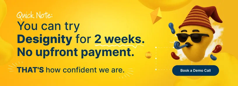
<div class="c-blog_comp-cta cc-component-1"><div class="c-blog_comp-cta-left"><div class="c-blog_comp-cta-left-wrap"><img src="https://global-uploads.webflow.com/61cdf3c5e0b8155f19e0105b/6369722e59155470b6840033_Potential-clients.png" loading="lazy" alt="" class="c-blog_comp-cta-left-img"></div></div><div class="c-blog_comp-cta-right"><div class="c-blog_comp-content"><div class="c-text-wrapper cc-mb-32"><div class="c-title-4 cc-bold"><strong>Want to save money without sacrificing the quality?</strong></div></div><div class="c-text-wrapper"><div class="c-text-2">Say goodbye to traditional, expensive agencies and unreliable marketplaces. Say hello to Designity.<br></div></div></div><div class="c-blog_comp-wrapper"><a href="/pricing" target="_blank" class="c-button cc-primary cc-inverted w-button"><strong>Get Your 2-Week Trial</strong></a></div></div></div>
The Easy Way to Eye-Catching Packaging Design
Good packaging design not only reflects well on your brand but also boosts awareness and sales too!
And if your brand is looking to launch a new product or revamp the packaging of your existing ones, then we hope the above tips have been useful to you as you contemplate the new direction your design will go!
But if you’re ready to implement the above design tips, you have some factors holding you back, like …
- A lack of designers
- You don’t have the bandwidth
- You don’t have the time
… there’s still a way to get everything your brand’s packaging design needs.
Why not consider partnering with Designity?
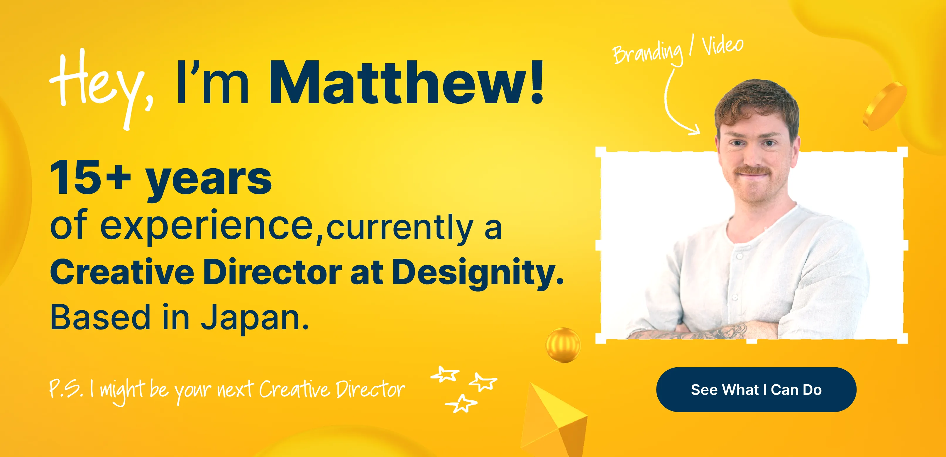
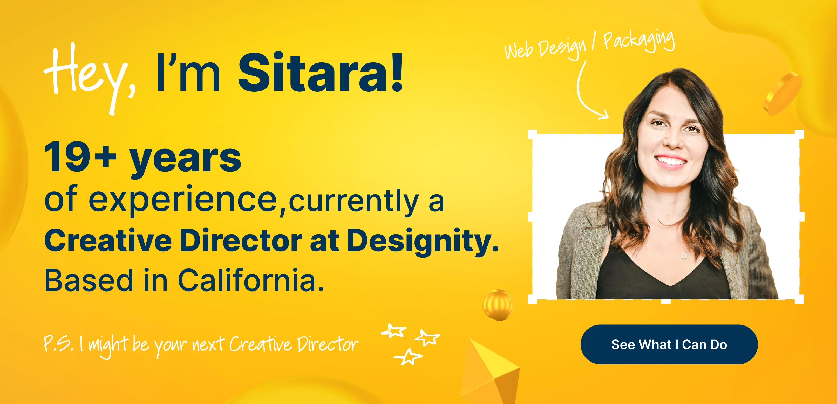
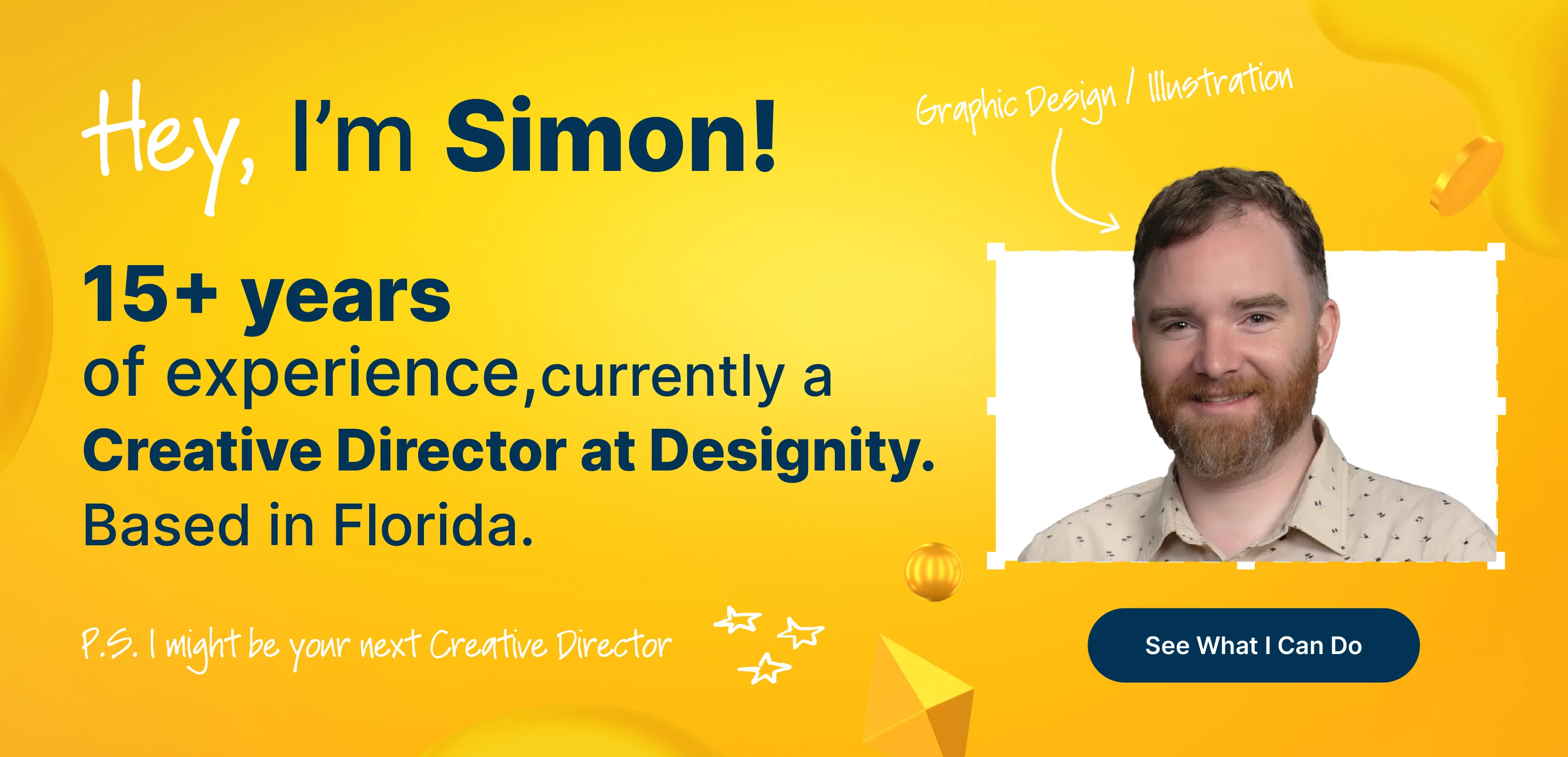
Designity is an innovative Creative as a Service platform that is made up of the best of the best in fields like package design, graphic design, illustration, copywriting, digital marketing, and more — everyone you need to breathe new life into your packaging design and get your products the attention they deserve!
And with each account led by a designated Creative Director to manage your creative and marketing team, guide your strategy, and make sure your assets are in your hands when you need them, you can get it all done without losing focus on where your business needs you most.
Check out our package design and label service page and portfolio to see how brands just like yours are standing out on shelves thanks to Designity’s experts. If you like what you see, go ahead and book your demo call. We can’t wait to get you started with a two-week, no-obligation trial so you can test-drive our design services and see why Designity is the package design partner your products are looking for.
Are you ready to elevate your package design?
.webp)